
Nokia Prism Series
2007 — Art Direction / Brochure Design
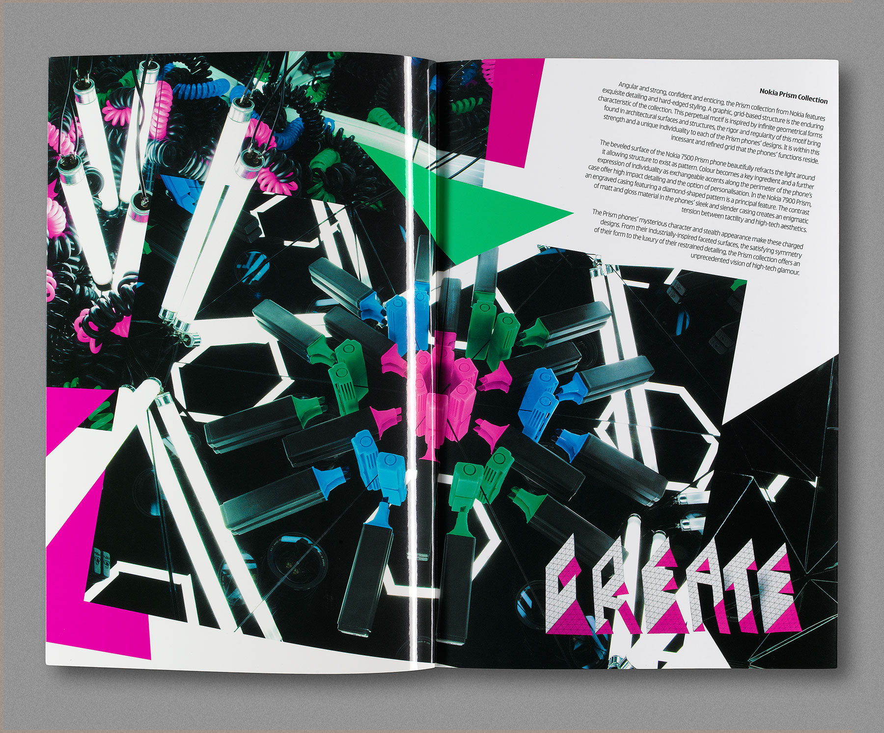
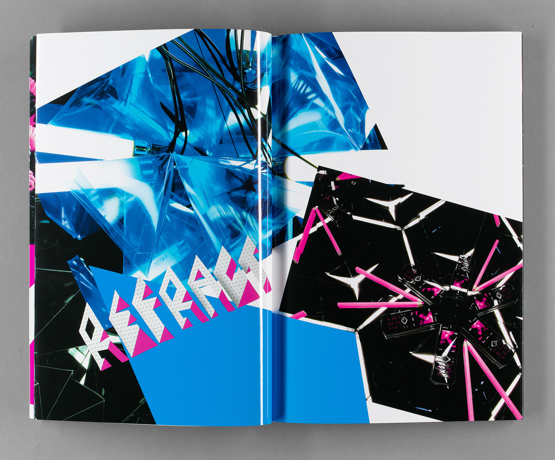
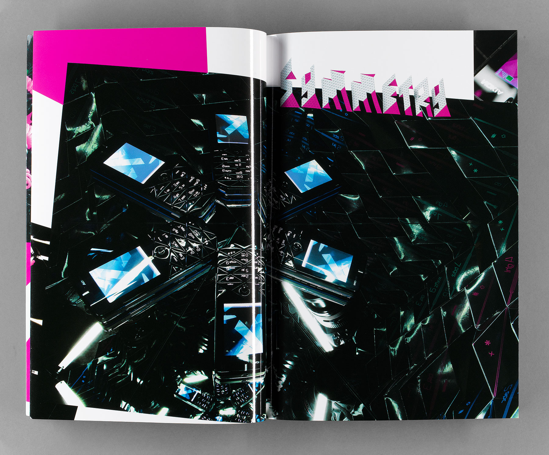
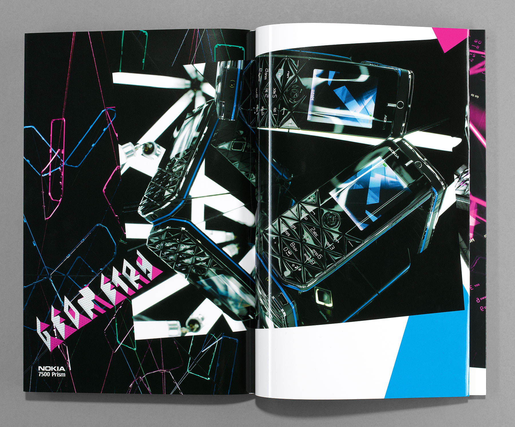
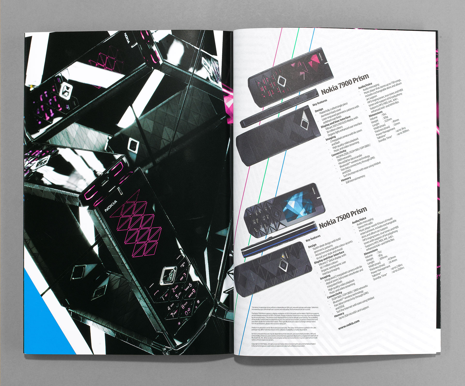
Multistorey were asked by Nokia to design the world-wide marketing brochures for the Prism Collection — a range of fashion-led mobile phones. Nokia’s industrial design team had been influenced by such diverse inspirations as geometric and symmetrical architecture, faceted jewel-like motifs, and cheap home-made angular post-punk graphics. To visually discuss these things we built a small triangular box lined with optical quality mirrors.
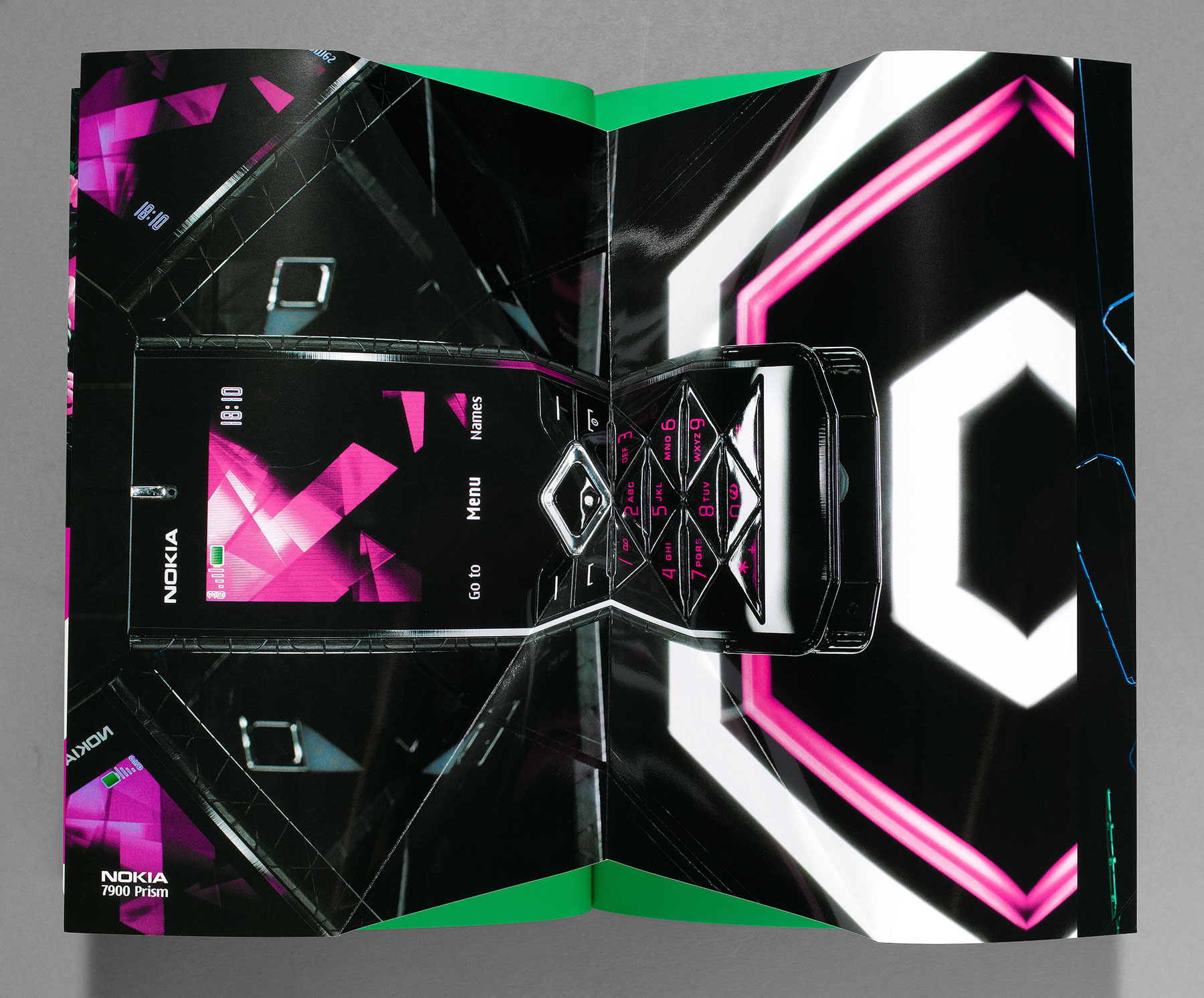
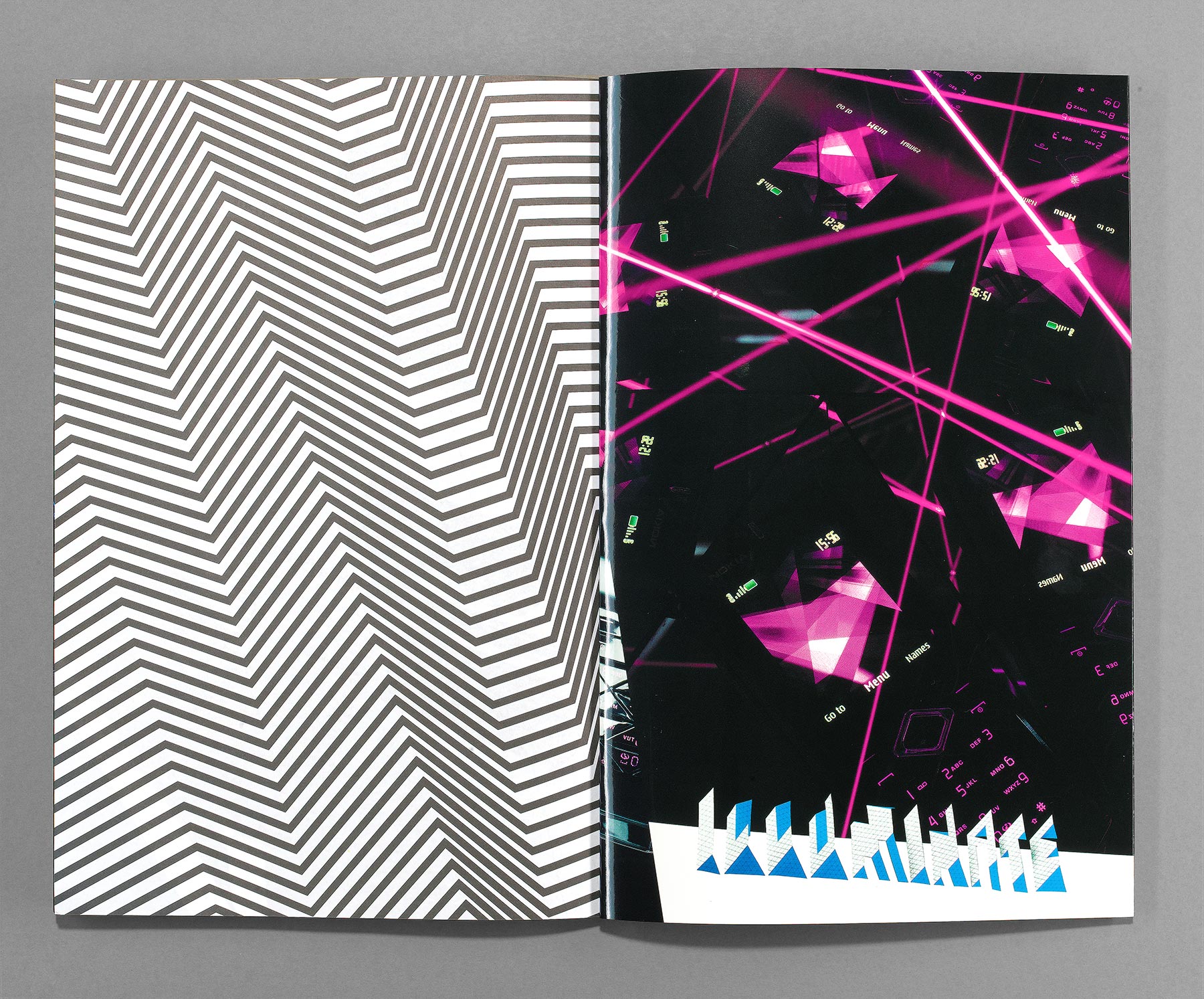
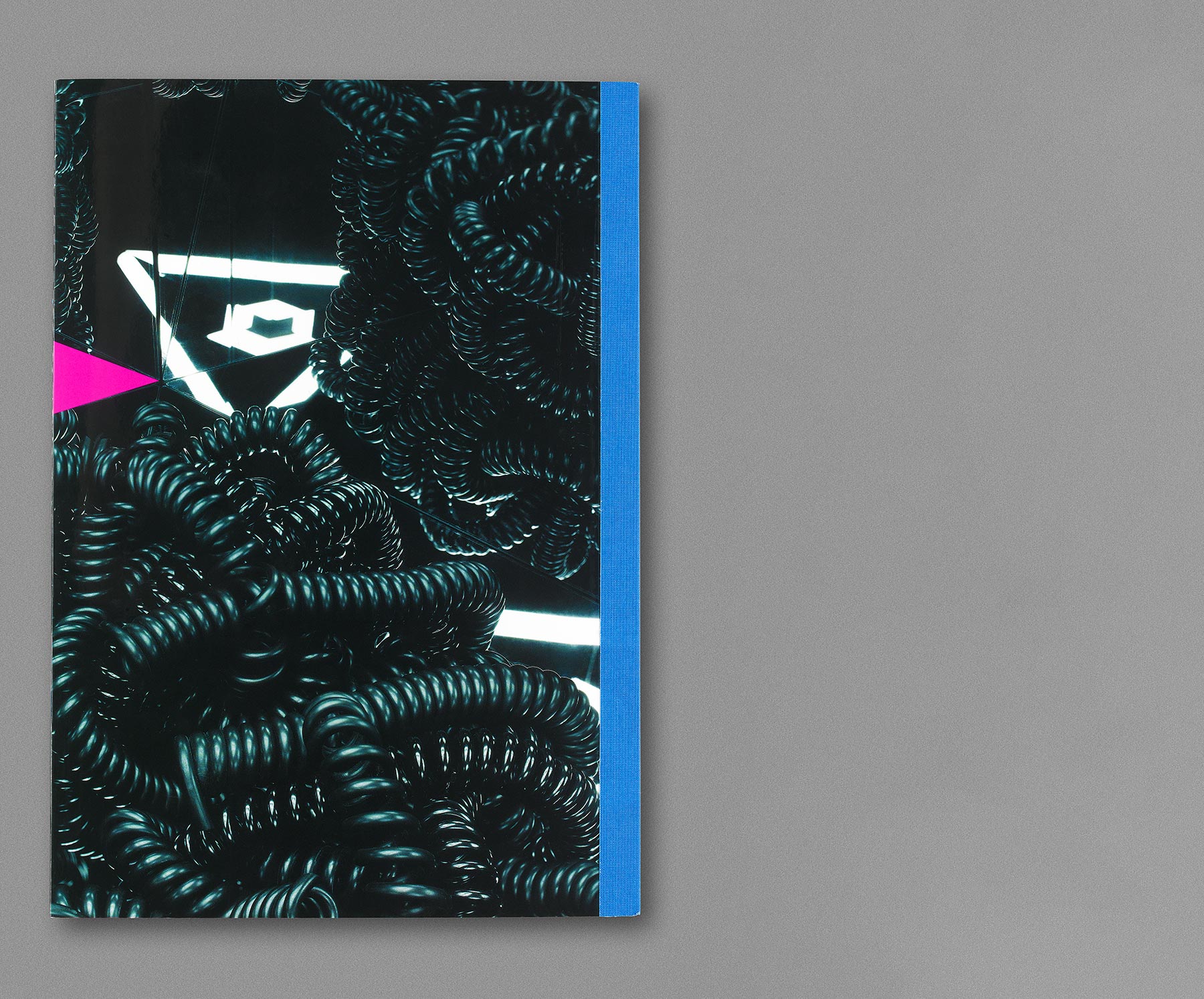
We wanted the shoot to be as honest as possible, but to create optical alchemy by turning our cheap and raw props — telephone-cable keyrings, drawing tools, light bulbs and handmade approximations of the handset’s keypad and screensavers — into infinite and beautiful sci-fi landscapes when placed within the reflective set.
The brochure itself was laid out as one long strip and pages were french-folded (and printed with solid fluorescent ink on the reverse) to enhance this wrap-around effect. The centre spread of the brochure is folded like a pop-up book along the angular lines of the keypad. The typographic headlines were made from hand cut and folded paper, photographed and overlaid on the geometric images to increase the level of 3-dimensionality. The brochures are printed on high gloss card and bound with electric blue tape creating a very tactile experience.
