

Philip Kingsley
2005 — Identity / Packaging
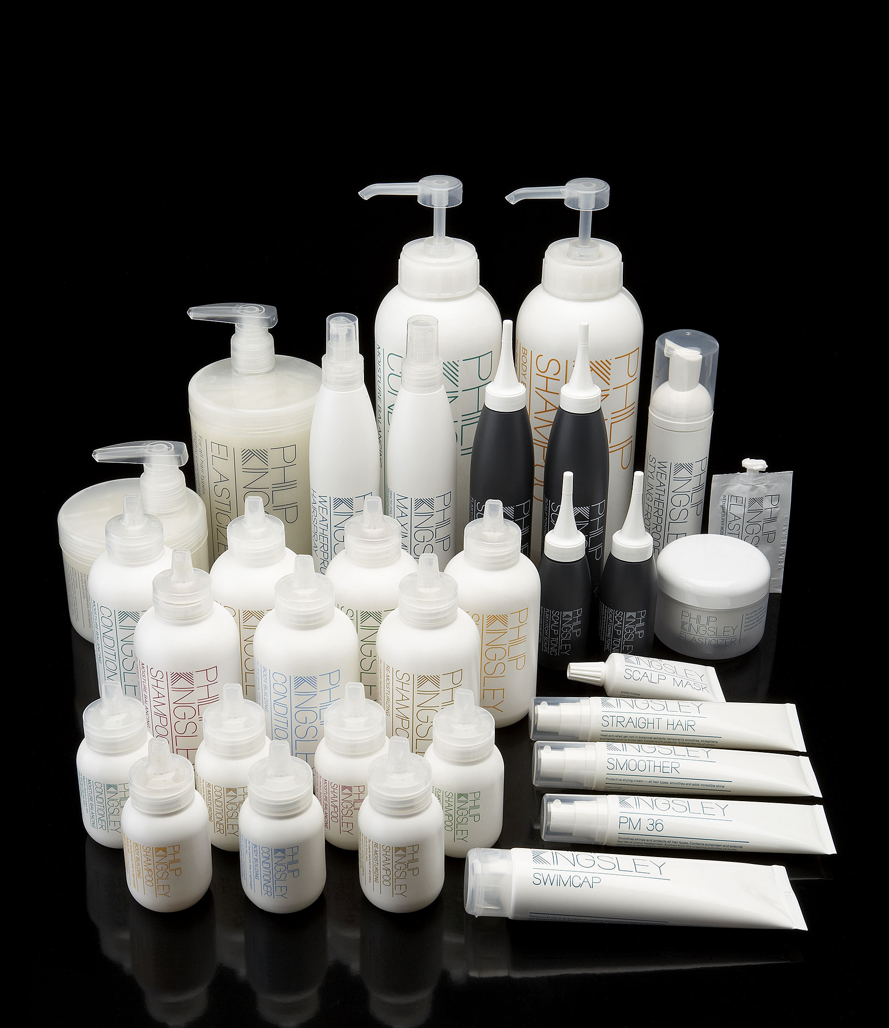
Philip Kingsley opened his first trichology clinic in 1968. Since then, he has sold a range of treatment products from his London and New York clinics. Multistorey were approached to re-brand and package his entire range of 35 products, with the aim of establishing the brand in salons and outlets outside their own clinics.
The logo consists of a specially drawn typeface which incorporates a K made from lines that resemble hair. The packaging design was kept simple and clean and easily navigable, as the existing client base ranges from very young to elderly people. Colour coding helps to define product grouping and also correlates to colours used in the original packaging to avoid confusion, although we selected a new set of hues within each colour palette to freshen the range. The boxes are made from a pearlescent stock, evocative of the clean, shiny appearance of healthy hair.
Our designs are still in use, close to their original form, fourteen years later.