Unpackaged
2013 — Identity / Retail Design / Interior Design
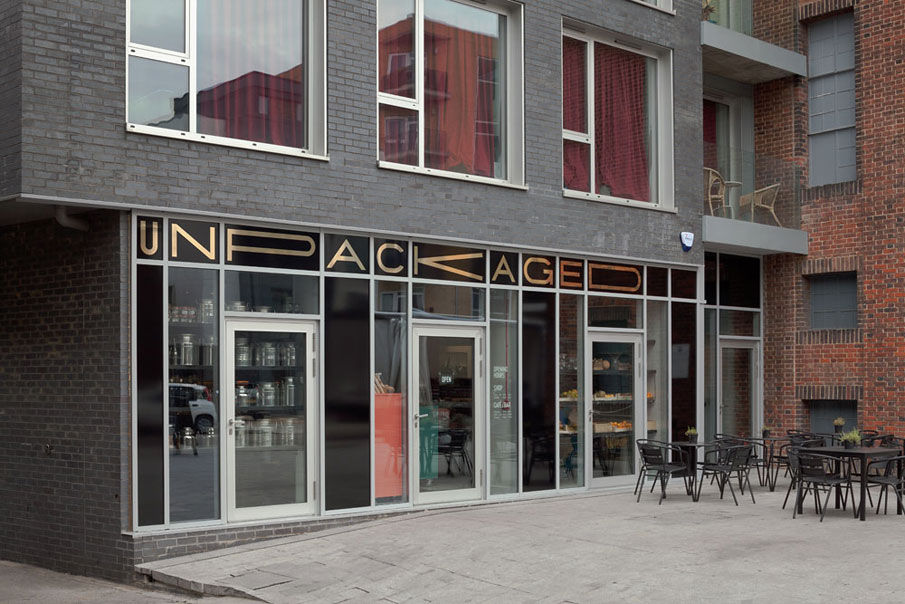
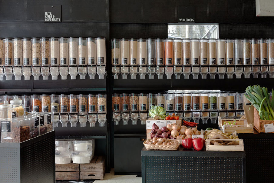
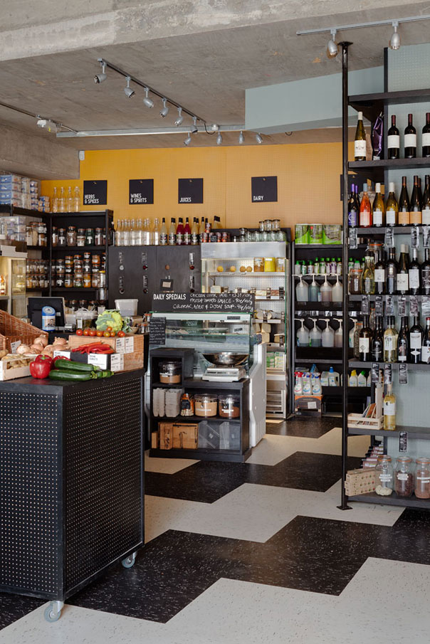
Unpackaged was a London café, bar and grocery, selling the majority of its products without packaging. After giving shape to their first incarnation in 2007, we were commissioned to design their new, larger 160m2 space in Hackney, with a very small budget and an (as far as possible) eco build.
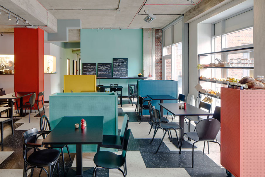
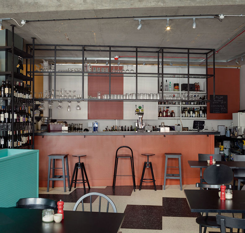
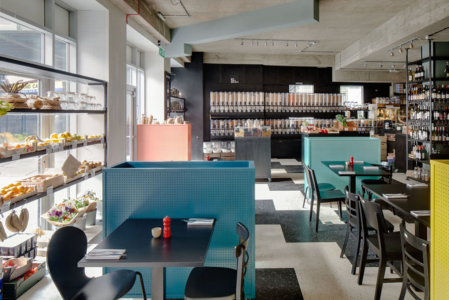
Our visual keys were a utilitarian 1950s pre-supermarket era of local grocers and busy high streets; coupled with Mediterranean café influences, inspired by the Spanish food and wine at the core of chef Kate de Syllas’ menu. This is manifested in our palette of rich ochre, inky and duck-egg blues, dusky coral with more vibrant tomato red, sunflower yellow and turmeric.
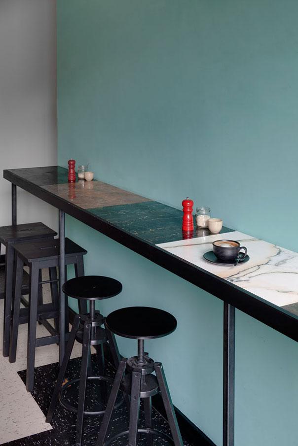
Three primary materials were used: Marmoleum for the ziggurat patterned floor, marble off-cuts for the bar and counter tops, and pegboard for the walls and wheeled room dividers. These create abstracted booths and visual breaks between the 40+ seats and tables, bringing intimacy to the originally quite cavernous space. A motley crew of salvaged and collected chairs and stools were stripped and painted black, creating unison and an informal texture to the landscape of the space.
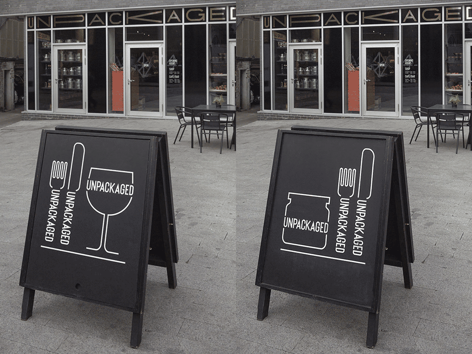
Without the budget to physically alter such a large and awkward façade, we decided to embrace the strange grid of windows and multiple doors, creating a bespoke typeface which expands and contracts to fill each window unit, with a condensed version used throughout the shop for signage and labelling. The original jar logo has been updated and is joined by a wine glass, knife and fork and coffee cup.
![]()
