Burberry
2003 / 2004 — Art Direction / Brochure Design
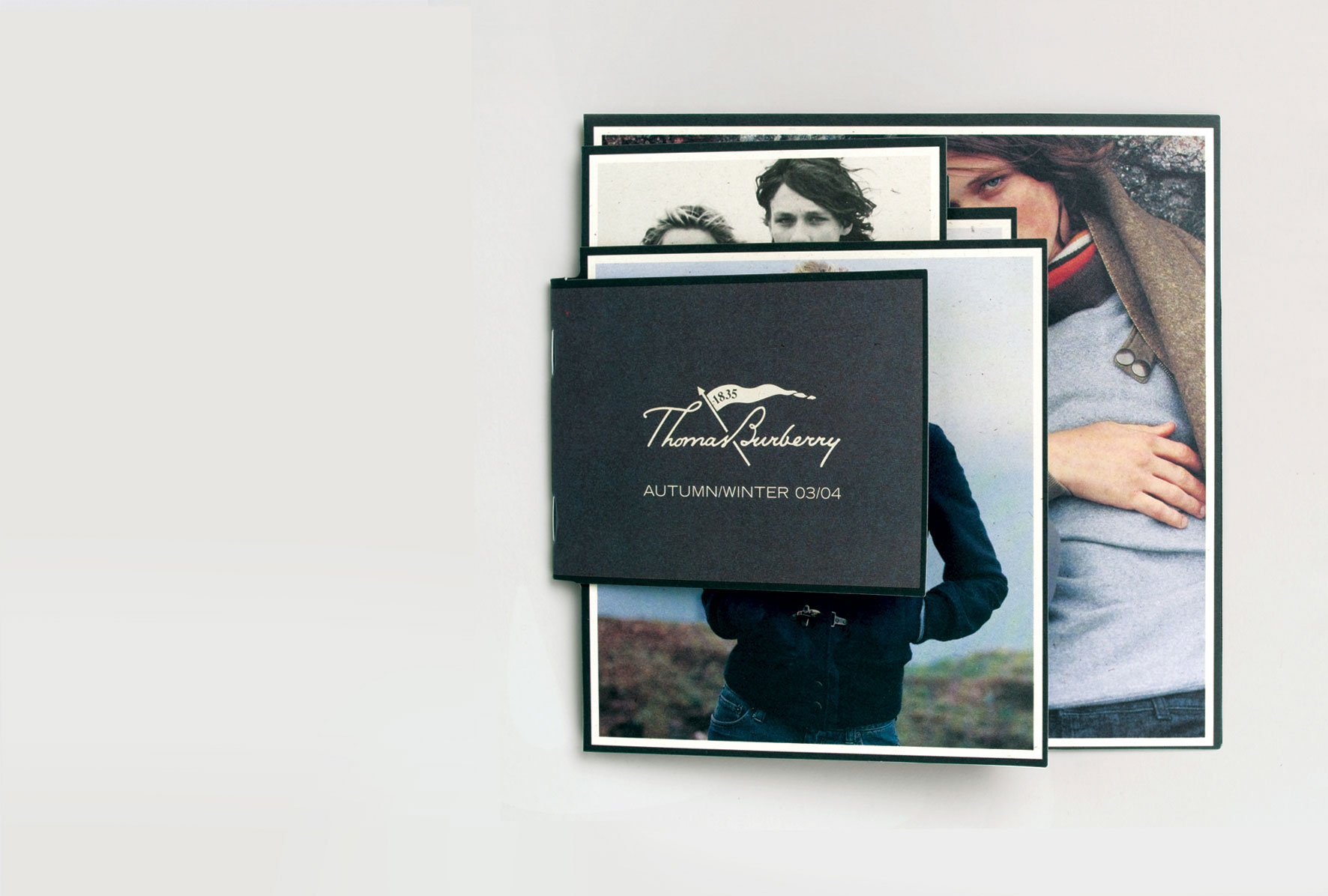
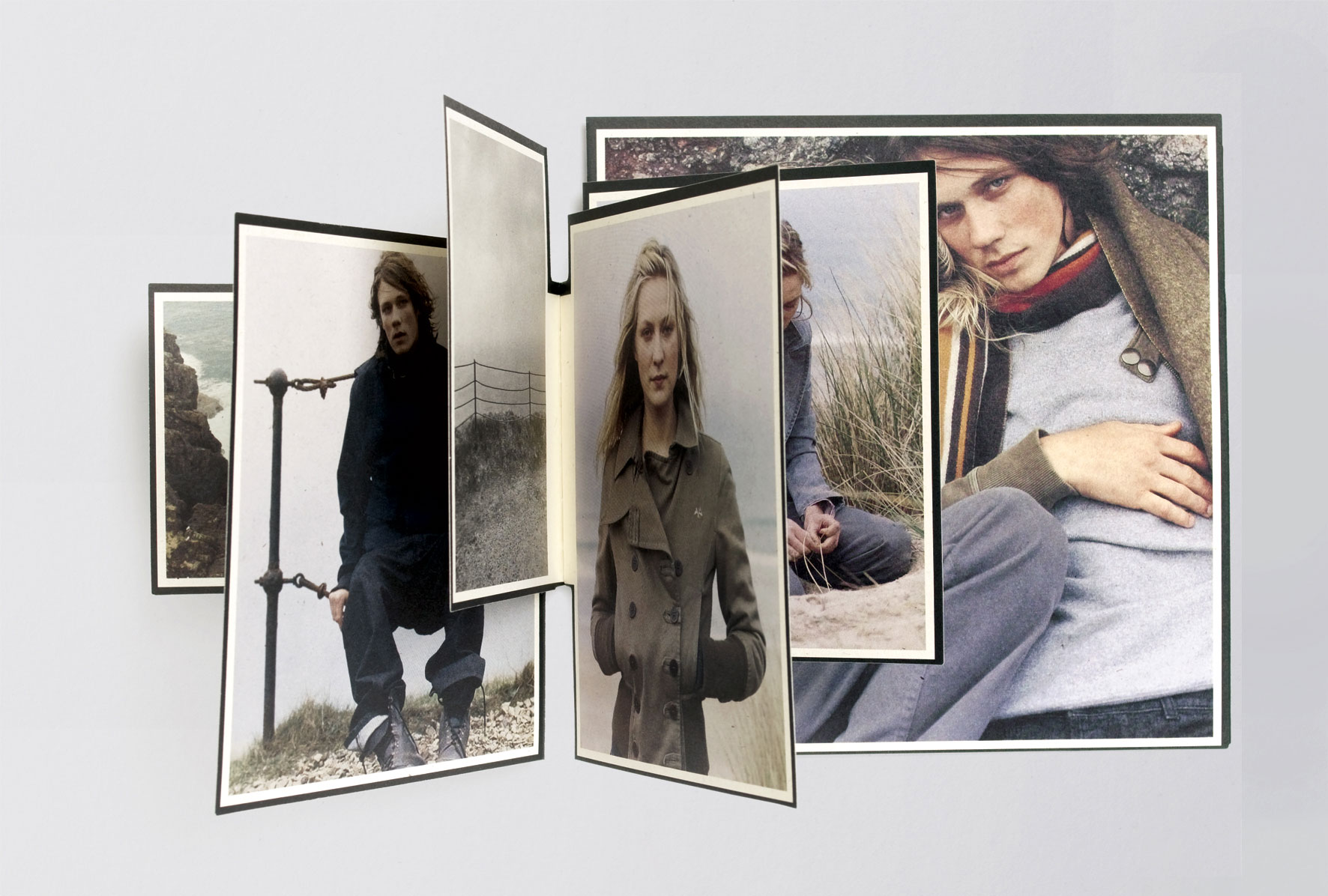
Barnaby Roper‘s photographs for the Burberry diffusion line’s autumn/winter brochure perfectly captured a blustery English autumn day at the seaside. Each page is a different size, to feel like one of the protagonists had hastily bundled together a scrap-book of beachcombings and photographs from their trip. The stock used is an oatmeal coloured card with visible flecks of darker fibre, which appear to be being blown around in the photographs. The black borders and off-white paper stock add to a feeling of timelessness.
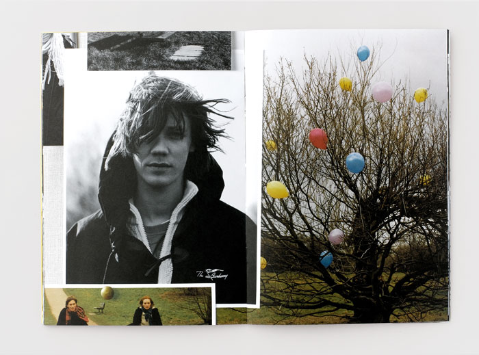
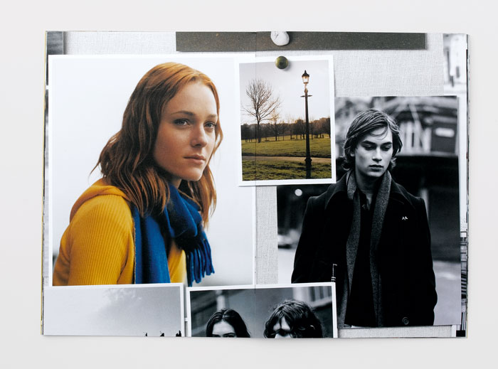
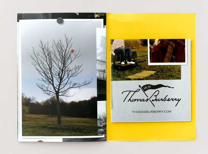
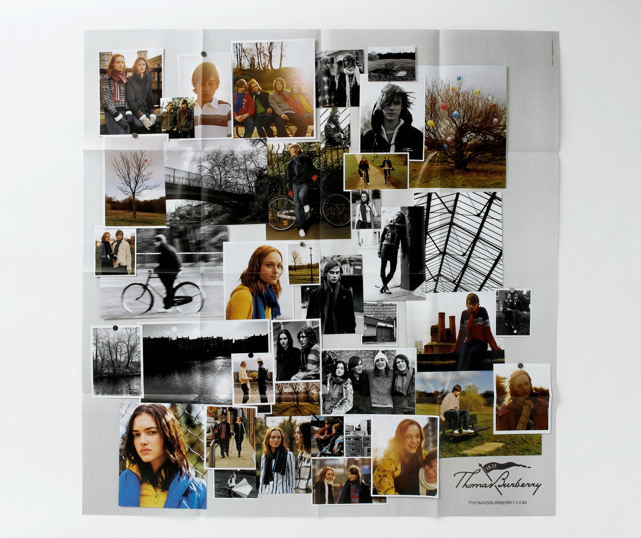
For the Autumn/Winter 04/05 brochure we again tried to capture a feeling of a personal collection of photographs. This time we created a huge collage of Barnaby Roper’s photos and used detail shots from it as each of the brochure's spreads. A photograph of the entire collage was printed as a poster and inserted into each copy. To complement the brochure we created press ads, instore posters and an instore/online short film for the collection.
