


Lund Humphries
2017 — Identity / Art Direction
The origins of Lund Humphries lie with the Bradford printing company Percy Lund, Humphries & Co, formed in 1895. Although it was the publisher of The Penrose Annual, a review of the graphic arts, from 1909, the real beginning of the firm’s publishing activities dates from the publication in 1939 of Frank Lloyd Wright’s An Organic Architecture. We have created a new visual identity system for them to reflect both this illustrious heritage, and their position as a 21st-century publisher of books on art, architecture and design.
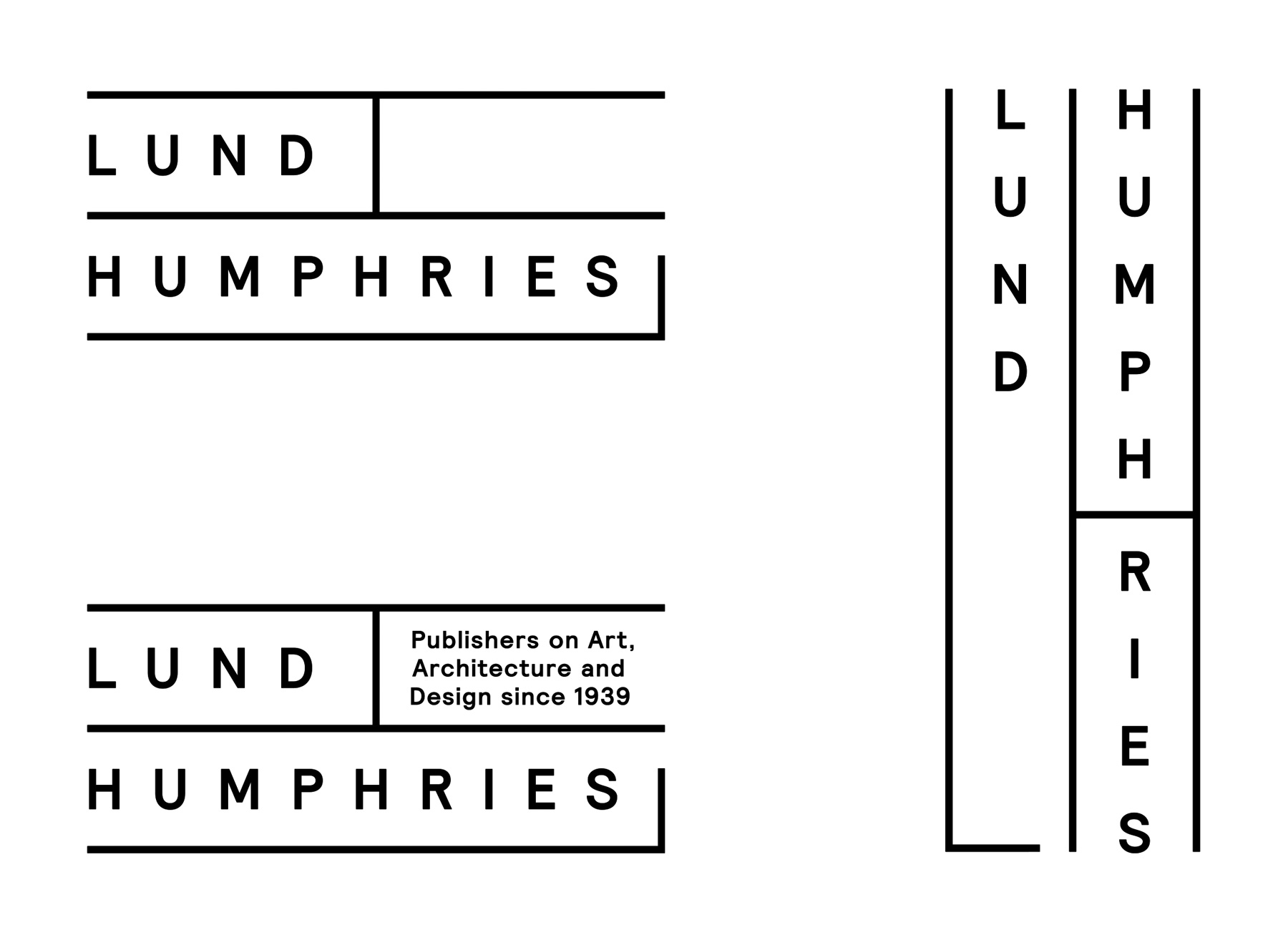
Three things guided our design process: firstly, the premise that the most important manifestation of a publisher's mark is on a book’s spine — this became a visual cue, as our very vertical typographic logo suggests books lined up on a shelf. Secondly, Lund Humphries had historically used both a full logotype and a spine monogram, whereas we wanted to combine the two for simplicity. Finally, the identity system had to be visually simple and neutral, as the range of imagery and content that it has to complement is extremely broad.
Inspiring the choice of typeface and use of elongated letters were key book jackets from the Lund Humphries catalogue, along with poster designs by Edward McKnight Kauffer, Lund Humphries’s first design director. For more everyday use we created a horizontal version of the logo, with an empty top right quarter which can be used for titles and secondary messaging. We supplied guidelines and thorough templates for the different marketing materials that Lund Humphries produce in-house, hence these images illustrating example mock-ups and not physical items.